


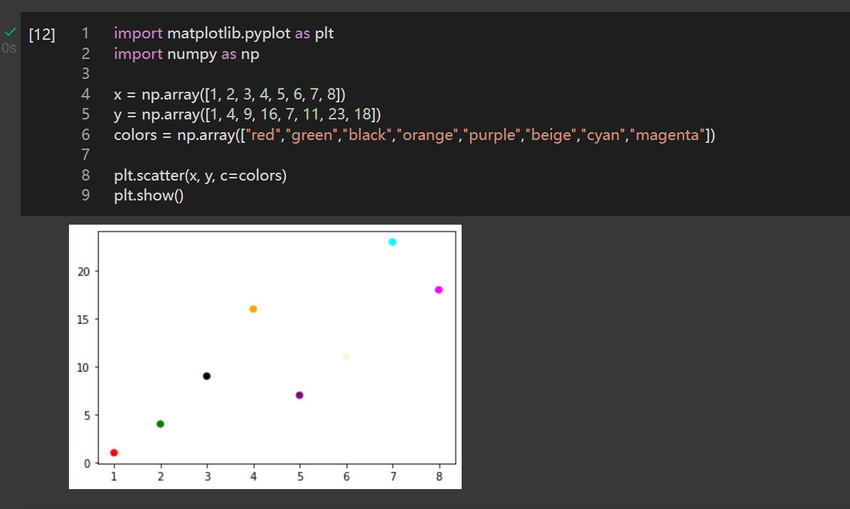
调整散点颜色
import matplotlib.pyplot as plt
import numpy as np

x = np.array([1, 2, 3, 4, 5, 6, 7, 8])
y = np.array([1, 4, 9, 16, 7, 11, 23, 18])
colors = np.array(["red","green","black","orange","purple","beige","cyan","magenta"])

plt.scatter(x, y, c=colors)
plt.show()

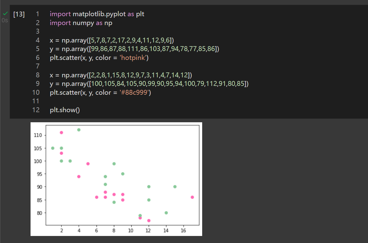
设置两组散点图
案例1:
import matplotlib.pyplot as plt
import numpy as np

x = np.array([5,7,8,7,2,17,2,9,4,11,12,9,6])
y = np.array([99,86,87,88,111,86,103,87,94,78,77,85,86])
plt.scatter(x, y, color = 'hotpink')

x = np.array([2,2,8,1,15,8,12,9,7,3,11,4,7,14,12])
y = np.array([100,105,84,105,90,99,90,95,94,100,79,112,91,80,85])
plt.scatter(x, y, color = '#88c999')

plt.show()
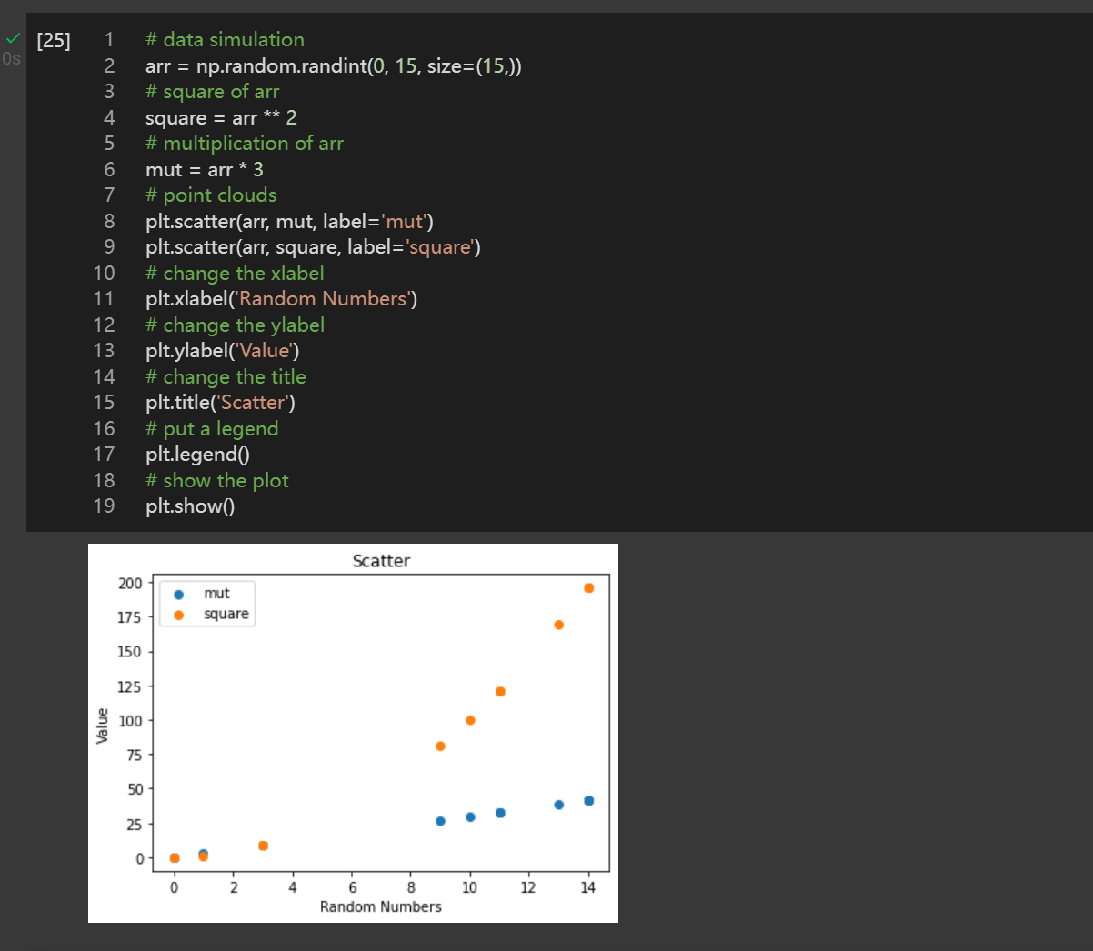
案例2:
# data simulation
arr = np.random.randint(0, 15, size=(15,))
# square of arr
square = arr ** 2
# multiplication of arr
mut = arr * 3
# point clouds
plt.scatter(arr, mut, label='mut')
plt.scatter(arr, square, label='square')
# change the xlabel
plt.xlabel('Random Numbers')
# change the ylabel
plt.ylabel('Value')
# change the title
plt.title('Scatter')
# put a legend
plt.legend()
# show the plot
plt.show()
原创文章,作者:朋远方,如若转载,请注明出处:https://caovan.com/03-yongyushujukexuede-python-jichuzhishizhimatplotlibzhong/.html
 微信扫一扫
微信扫一扫